

“Unlocking the Power of Color: Tips to Mix, Match, and Slay Every Outfit”
How to Mix and Match Colors Like a Fashion Pro
Fashion is an art, and like any form of art, understanding colors is crucial. Knowing how to mix and match colors in your wardrobe can take your style from basic to breathtaking. Whether you’re aiming for bold and dramatic or subtle and polished, mastering color combinations ensures your outfits always stand out for the right reasons.
In this detailed guide, we’ll delve deeper into color theory, how to create stylish pairings, and the secrets to using colors to express your personality.
- Diving Deeper into Color Theory
Color theory isn’t just for painters; it’s the foundation of great style. At its core is the color wheel, a visual representation of how colors relate to one another.
Understanding Warm and Cool Colors
- Warm Colors: Red, orange, and yellow exude energy and vibrancy. They’re perfect for making a bold statement or evoking warmth.
- Cool Colors: Blue, green, and purple feel calm, serene, and sophisticated.
Hue, Tint, Shade, and Tone
- Hue: The pure form of a color (e.g., red or blue).
- Tint: A color mixed with white, resulting in a lighter hue (e.g., pastel pink).
- Shade: A color mixed with black, creating a darker version (e.g., burgundy).
- Tone: A hue mixed with gray, creating a softer, more subdued look.
Understanding these variations helps you create outfits with depth and interest.
- Advanced Color Schemes for the Bold and Curious
While basic schemes like complementary or monochromatic are great starting points, advanced schemes can elevate your style.
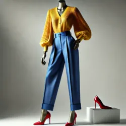
Triadic Colors
Triadic schemes use three evenly spaced colors on the wheel, such as red, blue, and yellow. These combinations create vibrant, balanced looks.
Example: Pair a yellow blouse with royal blue trousers and red shoes.
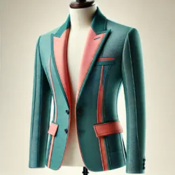
Split-Complementary Colors
This scheme involves a base color and two adjacent colors to its complement. It’s bold but less dramatic than true complementary colors.
Example: A teal jacket with coral and light pink accents.
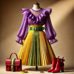
Tetradic (Double Complementary) Colors
Tetradic schemes involve four colors: two pairs of complementary hues. These create dynamic, colorful outfits.
Example: Combine shades of purple, yellow, green, and red for a playful yet harmonious ensemble.
- Breaking Down Neutrals in Greater Detail
Neutral colors are often overlooked, but they’re indispensable in building versatile wardrobes.
Expanded Neutral Palette
- Classic Neutrals: Black, white, gray, and beige.
- Soft Neutrals: Cream, taupe, and light gray.
- Dark Neutrals: Charcoal, navy, and deep brown.
Neutrals as Outfit Anchors
When wearing a bold color, pairing it with a neutral keeps the look grounded. For example, a bright yellow skirt looks chic with a crisp white blouse.
All-Neutral Ensembles
Layering multiple neutral shades can be incredibly chic. Try a camel coat over a gray sweater with white trousers. Add texture for interest—like a knitted scarf or suede shoes.
- The Power of Texture and Fabric in Color Matching
Colors aren’t the only element to consider; textures and fabrics play a significant role in how colors are perceived.
Matte vs. Shiny Finishes
- Matte fabrics, like cotton and linen, make colors appear softer and more casual.
- Shiny fabrics, like satin or metallics, amplify the intensity of colors and feel more formal.
Layering Textures
Mixing textures—such as pairing a chunky knit sweater with sleek leather pants—adds depth to monochromatic or neutral outfits.
Example: A monochrome beige outfit becomes striking when you combine a wool coat, silk blouse, and leather boots.
- Seasonal Color Palettes: Matching Nature’s Hues
Fashion often takes inspiration from the seasons, and incorporating seasonal colors can make your outfits feel fresh and appropriate year-round.
Spring Palette
Light, fresh, and pastel tones dominate spring fashion. Think blush pink, mint green, and baby blue. Pair these with neutrals like cream or beige for a delicate look.
Example Outfit: A mint green sundress with a cream cardigan and blush pink flats.
Summer Palette
Bright and bold shades like hot pink, turquoise, and sunny yellow rule the summer. These colors evoke energy and fun.
Example Outfit: A coral tank top with white shorts and turquoise accessories.
Fall Palette
Autumn brings rich, warm colors like mustard yellow, burgundy, and olive green. Earthy tones dominate this season.
Example Outfit: A mustard sweater with brown boots and a plaid scarf in coordinating hues.
Winter Palette
Winter fashion leans toward deep, jewel tones like emerald green, royal blue, and ruby red, as well as icy shades like silver and icy blue.
Example Outfit: A navy coat with an emerald scarf and black boots.
- Mastering Color Blocking and Patterns
Color blocking and patterns are advanced styling techniques that can make your outfits unforgettable.
Color Blocking Tips
- Choose 2–3 bold colors from complementary or triadic schemes.
- Use clean lines and solid colors for a sleek, modern look.
Example: Pair a cobalt blue top with fuchsia pants and yellow heels.
Pattern Mixing for Experts
- Combine patterns with similar color schemes.
- Mix large patterns with smaller ones to avoid overwhelming the look.
- Stick to a neutral base when experimenting with bold prints.
Example: A striped black-and-white blouse paired with a floral skirt that incorporates similar tones.
- Finding Your Unique Color Signature
While trends come and go, finding colors that flatter your skin tone and personality ensures timeless style.
Understanding Undertones
- Warm Undertones: Look great in earthy and sunny shades like peach, terracotta, and olive.
- Cool Undertones: Shine in icy tones like lavender, navy, and cool pinks.
- Neutral Undertones: Can wear both warm and cool shades effortlessly.
Experimentation is Key
Start small by testing different colors with accessories. Over time, you’ll naturally gravitate toward shades that make you feel confident.
- Styling Tips for Everyday Life
Practicality is essential when mixing and matching colors. Here are tips to incorporate into your daily wardrobe:
Workwear
- Stick to neutral or monochromatic palettes with subtle pops of color, like a burgundy handbag with a charcoal suit.
Casual Outfits
- Experiment with fun combinations like a pink hoodie paired with teal joggers and white sneakers.
Evening Attire
- Go bold with complementary colors, such as a sapphire blue dress with orange heels and gold jewelry.
Conclusion
Mixing and matching colors like a fashion pro isn’t just about following rules—it’s about creativity, confidence, and a willingness to experiment. By understanding color theory, using different schemes, and paying attention to texture and fabric, you can create outfits that reflect your personality and make a statement. Whether you’re dressing for work, a casual day out, or a glamorous evening, the perfect color combination is always within reach.
FAQs
- Can I wear clashing colors intentionally?
Yes! Clashing colors, like pink and orange, can look trendy when styled thoughtfully. Use accessories to tie the look together.
- How do I mix bright colors without looking over-the-top?
Balance bright colors with neutral pieces or use smaller doses, like a bright scarf or shoes.
- What’s the easiest color scheme for beginners?
Monochromatic schemes are simple yet stylish. Start by pairing different shades of one color.
- Are there any “rules” for accessorizing with color?
Keep accessories in the same color family as your outfit, or use them to introduce a pop of complementary color.
- What’s the safest way to experiment with patterns?
Stick to one patterned piece and pull other colors from the print to build the rest of your outfit.
